Building a better climbing app
In 2018, while travelling, I designed and developed a rock climbing guidebook app for the Railay Beach, Thailand. I followed a lean UX research process, and built a minimum viable product in react.js.
I used webscraper.io & phantom.js to gather publicly available climbing route information. My travel partner and I then photographed & documented the routes and wrote the initial copy. The project took just over 30 days.
Best viewed on mobile: Railay Guide v0.1
Initial Research & Findings
Climbing is perfect for guerrilla user research. For every person climbing, you'll find three or four hanging out at the base of the cliff. I Interviewed 7 international climbers in the Tonsai/Railay area in Thailand on their process for researching climbing areas.
Discovering an area
For broader area info, most people preferred blog posts & forums rather than technical & route information. At an early stage, people cared about the top climbs, facilities, prices, access & approach, community and likelihood of finding partners, grades and weather.
On arriving in an area
If people intend to stay for a long time, they will buy a guidebook, For shorter trips, it’s a social norm to take photos of relevant guidebook pages. Unless they meet other climbers, people tend to look for the easiest accessible crag with a bunch of climbs within their grade range.
Approach information
Directions to the area came up several times in the interviews. Neither books or sites do a good enough job describing how to get to the climbs. A climber mentioned one guidebook step being “Walk through the jungle for 20 minutes”. People like a lot more detail than that. Several mentioned google maps & maps.me pins being useful, but in many area's paths aren't marked on these services. Step by step directions with photos was also suggested.
Trust
Incorrect info is a fear for climbers, particularly dodgy bolts, route length and ending up on the wrong climb.
People trust info directly from other climbers the most. In general people also set much higher standards for guidebooks, often preferring an out of date guidebook to a website. There's an expectation that online information is unreliable.
Apps & Websites
Nobody was loyal to a particular climbing app or website, but they would often come across these sites in their google results, with 27 crags mentioned by about half of the group, and vertical life mentioned by a couple of people.
Competitor Analysis
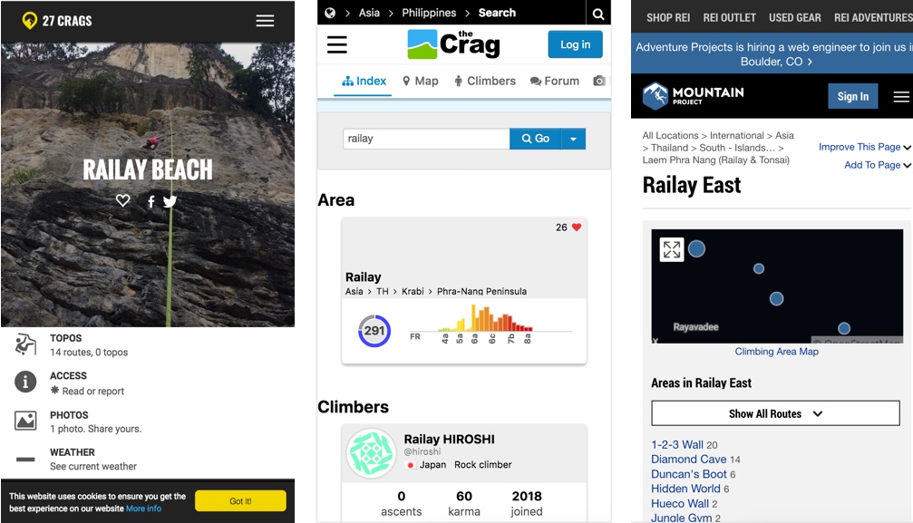
27 crags, thecrag, mountainproject and vertical life were all major climbing sites/apps. On reviewing these sites, I noticed a number of elements at odds with the user interview results.
They provided in depth technical information about the general area, rather than a few paragraphs: weather data, graphs of grades etc.
The information was structured around the whole world, rather than local climbing areas.
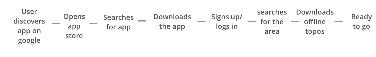
The process for installing an apps and downloading user information was complicated.
Steps to install
Research Takeaways
- Think Local, not global.
People aren't loyal to any one site, they want the best info for wherever they are right now. - Skip the Graphs.
For general area info, people prefer an easy to digest blog post or youtube video.
- Location, Location, Location
provide really good approach info. Nobody wants to get lost on the way to a climb. - Replace the 'photos of a guidebook' on a climber's phone
If the information is good, and available offline, people are happy to use their phones at a crag.
Armed with this research, I put began designing. Providing general area information as a blog post, rather than data would allow users to discover our app through search & sharing, and using googles progressive web app format would allow users to make it available offline.
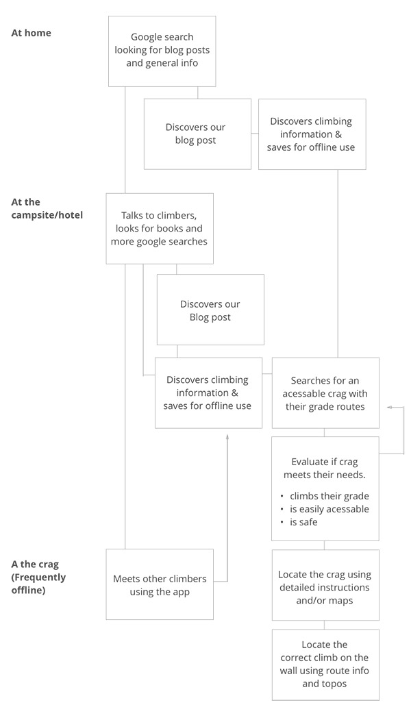
User Journey
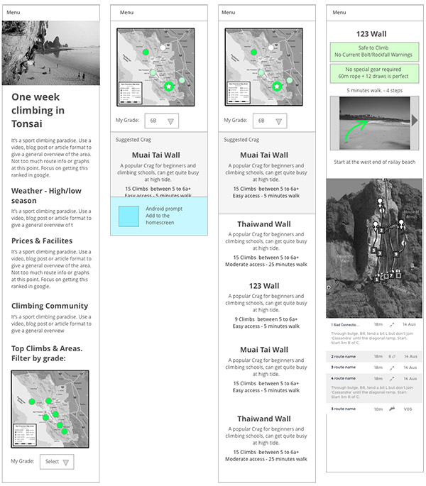
Wireframes
Clickable Wires
I created a simple clickable mockup of the site (I usually use Invision for this) allowing me to talk through how the site will behave and identify any major usability problems early.
Clickable Wires
Coding
I wanted to tackle the most technically challenging tasks early in the process, so I built an early technical prototype, based on mount Arapiles in Victoria.
- Used webscraper.io to collect public domain route information.
- Built the core of the site in react, including functionality to filter routes.
- Initial attempt at visual style & some simple css animation tests.
- Set up the test site as a Progressive web app, allowing offline access saving the site to a mobile home screen.
Minimum Viable Product
Following the lean startup methodology, I developed an MVP, ignoring all but the most essential features in order to get a working version of the app with real data.
- Updated the design based on the initial wireframes.
- Added a general guide to the island and crag information
- Photographed route approaches and topos
- Updated the visual design.
- Launched a working alpha version of the app
Features
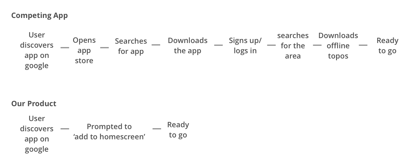
Easy offline install
Here are the steps required to install our progressive web app, vs a competitor's traditional android app.
No more getting lost
Directly responding to users concerns, we provided step by step instructions to reach areas not covered by google maps.
Filter by grade
In a guidebook, users need to check that a climb isn't too difficult. We only show climbs within their ability.