
All Out Design
All Out Design is a Dublin based creative agency that creates graffiti art and murals for businesses, ad campaigns and events. I worked remotely with the team to improve the conversion rate of their website. This included UX research, visual design and developing a prototype in react.
TLDR: View the Original contact page | View the Proposed Changes
Initial research & ideas
Analytics & Adwords data showed where traffic was coming from, where traffic was dropping off and a little demographic data. The form submission data, plus some interviews with management gave me an idea of what sort of requests were coming through and a little info about the customers themselves.
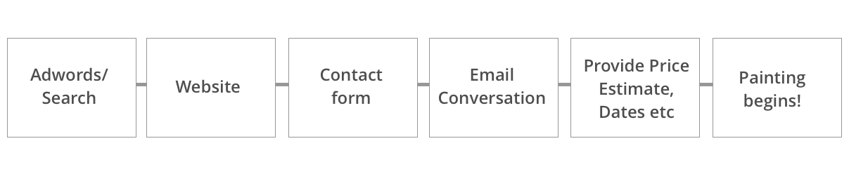
User flow (simplified)
Personas
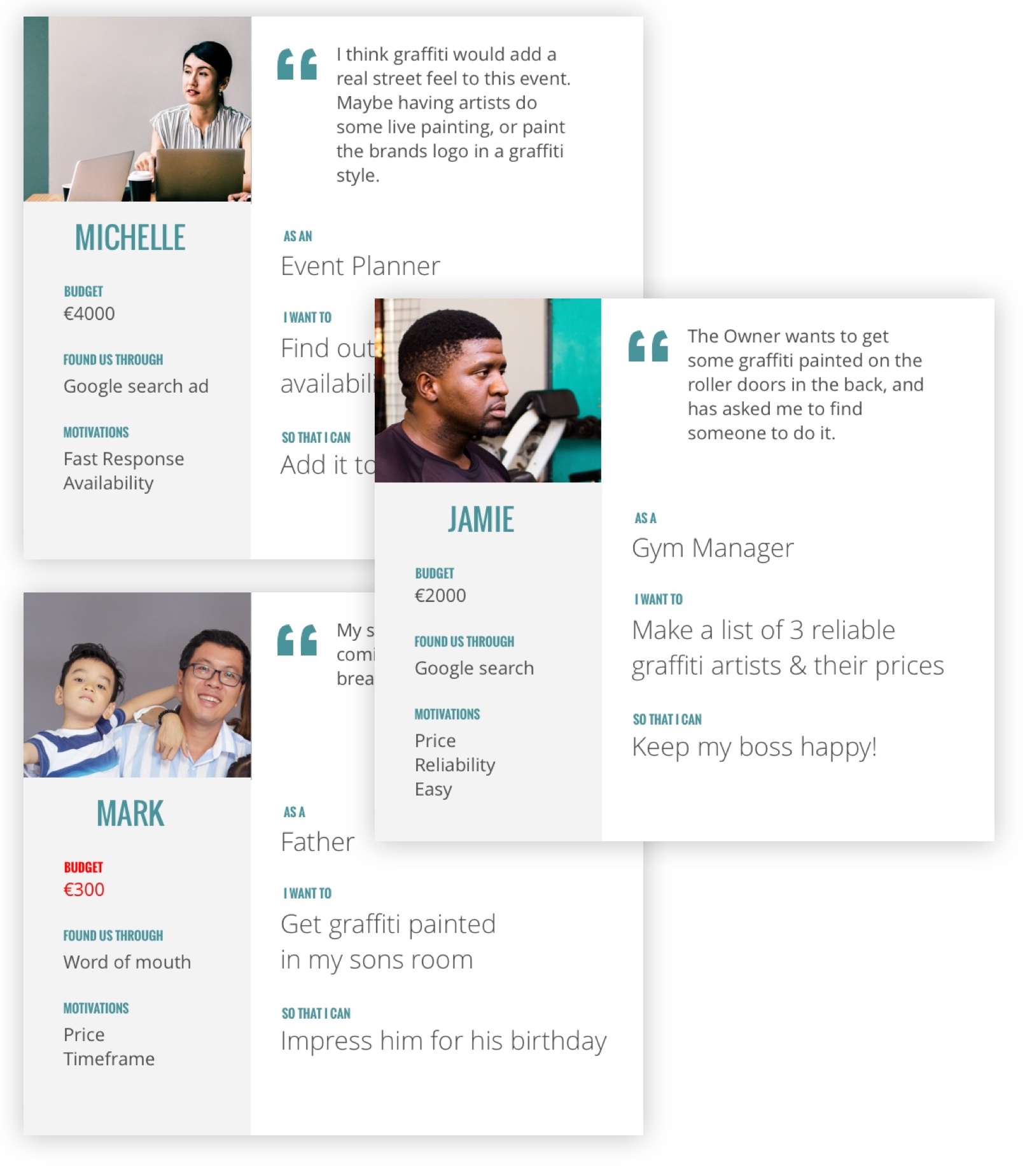
Narrowing our audience
Many high value customers, like Jamie & Michelle needed to get costs approved by their boss or client. They were generally time poor, and had deadlines to meet. The current process was to fill out a contact form, and wait for someone to email back a price. We decided to focus our efforts on improving this interaction.
Hypothesis
We believed that by providing business customers with an instant price estimate, they'd be more likely to present our services to their boss and ultimately more likely to use our services.
We could validate this by building a prototype and A/B test it against the existing site. If our assumption was correct, we'd see an increase in the number of qualified* leads coming through from the site.
*Customers with realistic price expectations, who are in a position to buy our product.
Early concept wireframes:
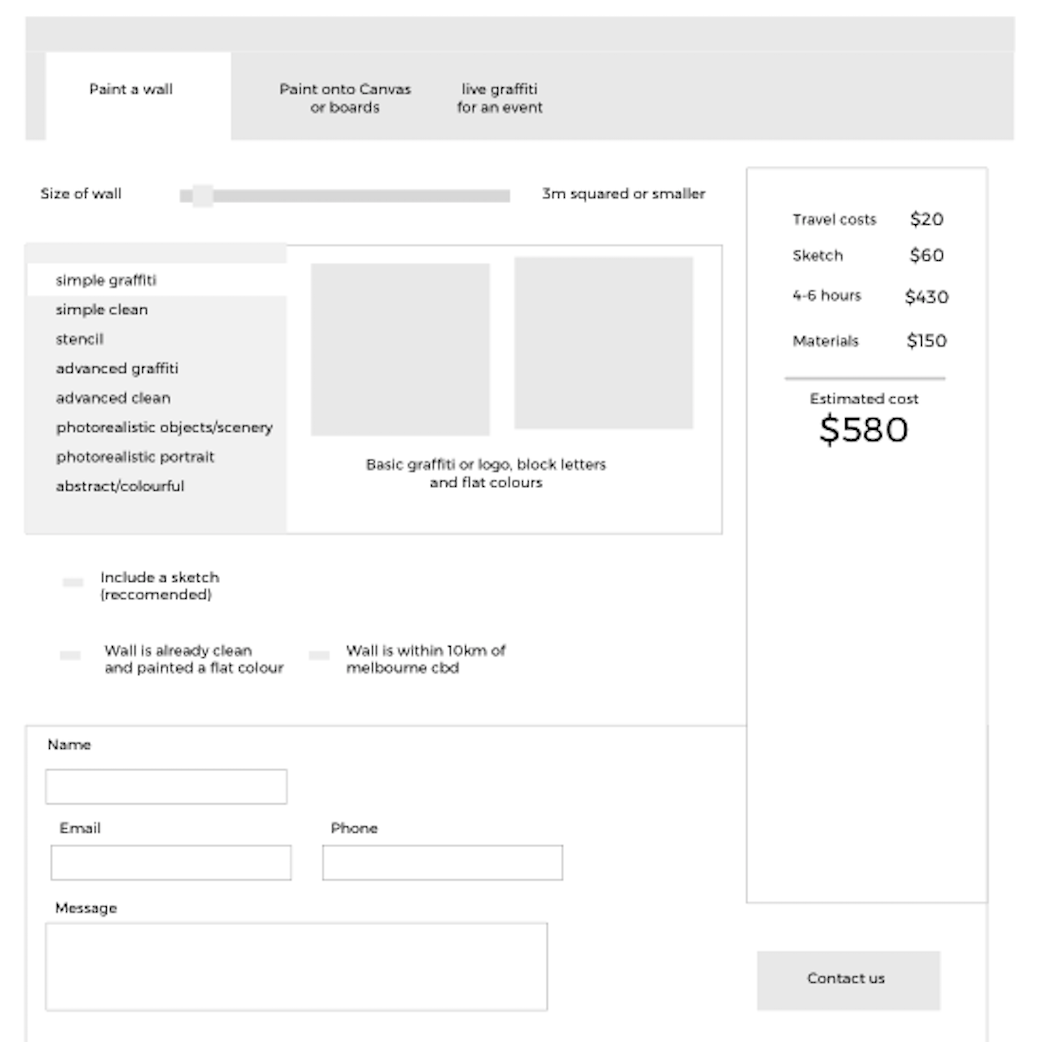
The first prototype
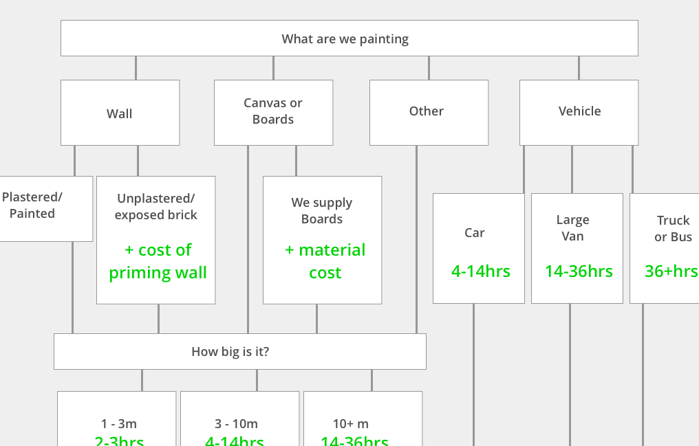
I created a flow chart of the questions the All Out team asked new customers and documented the impact various answers would have on price. We ran some past requests through the flowchart, tweaking it to closer match the estimates supplied by the team.
To get some early feedback, I built a simple html form and used javascript to generate a price estimate.
User Feedback & Observations
- People were most comfortable answering direct questions with short objective answers, describing the space, timeframe, etc.
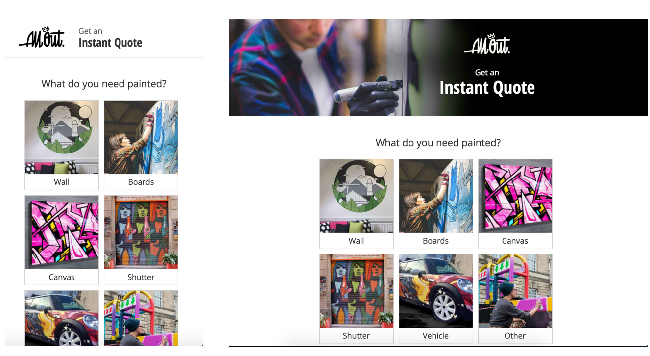
- Capturing creative requirements in multiple choice boxes was awkward and impersonal. It also didn't have a huge impact on price. I removed it from the calculation and added a simple text box for creative requirements.
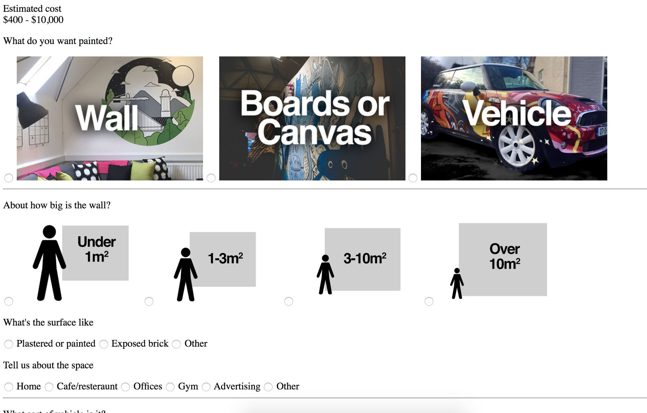
- People don't know exactly what size their wall is. Rather than ask for a specific number of meters squared, I switched to a multiple choice answer big/medium/small, plus a human figure for size reference.
- The form was too long, people were intimidated by the idea of filling it out. I removed several unnecessary questions and answers, and divided the form into multiple simple steps to reduce the cognitive load.
Prototype v2
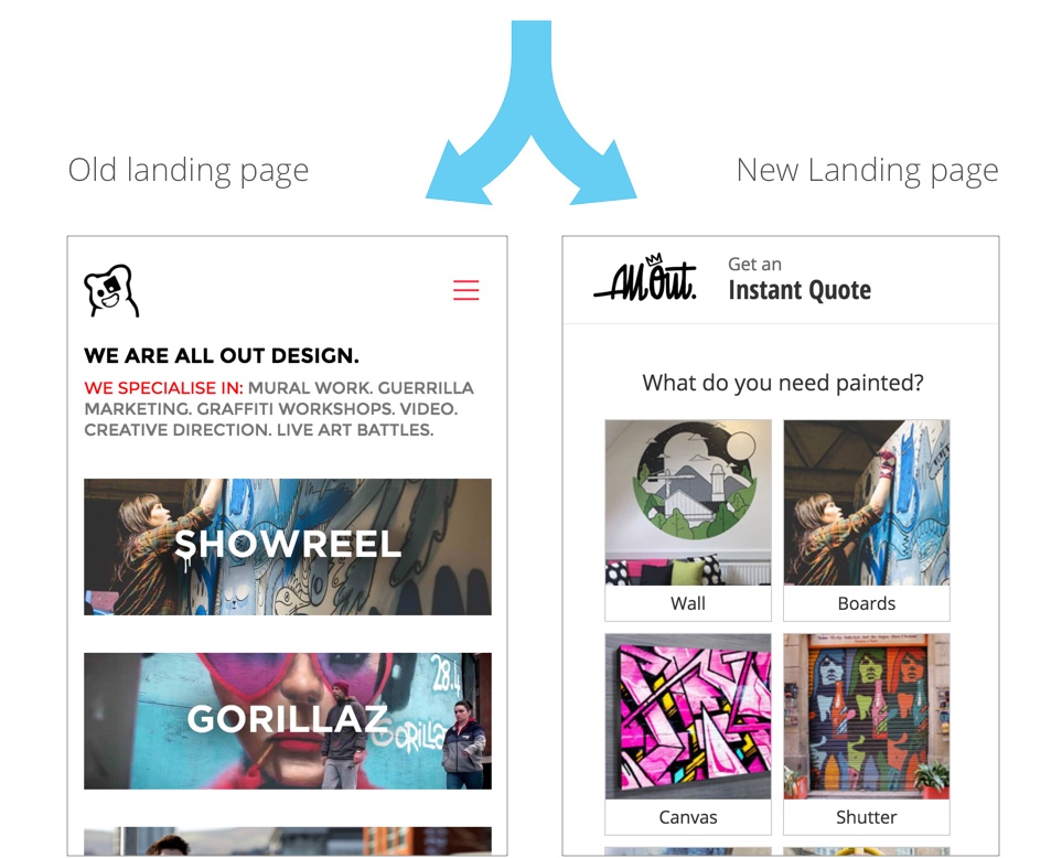
Validating the idea
I built out the final prototype in react and hosted it on a separate server from the main site. I then set up an A/B test in Adwords, splitting the traffic between the existing landing page and the prototype.
Results
After running the campaign for a month, the prototype showed an increase in the quality of leads coming through - better response rates and higher value customers.